Introduction
I gave a talk on the 27th of February 2020 at PyData Copenhagen where explored different ways of visualizing geospatial data using python. The examples were created based on GPS trajectory dataset collected in (Microsoft Research Asia) Geolife project by 182 users in a period of over three years (from April 2007 to August 2012). The dataset contains 18670 files and 24.876.978 positions.
Details on where to get the dataset and how to run the examples can be found in the GitHub repository: github.com/tjansson60/geospatial
This blog post is only meant as a teaser to this repository that contains a lot of notebooks with comments and examples to redo it all locally. In the talk, I went through the following topics:
- Preprocess data into parquet files
- How to read the data and explore it
- Basic plotting with matplotlib, cartopy, and geopandas
- Folium – interactive maps
- bokeh – interactive visualization library
- Datashader/holoviews – plotting very large datasets (Does not render correctly in jupyter-lab, but works in jupyter-notebook)
- Datashader zoom movie
- Datashader timeseries movie
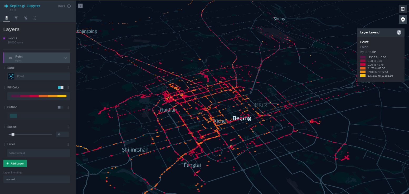
- kepler.gl – interactive HTML map with controls (Does not render in jupyter-lab, but works in jupyter-notebook. Output HTML works in either case)
- Custom contour map in folium
Before digging into the GitHub repository: github.com/tjansson60/geospatial I started the talk going through some basics of geospatial data:
Coordinate Reference Systems (CRS)
Geospatial data must include information about the CRS. A CRS has 2 key properties listed below, but often also has extra information as UTM zones etc:
Datum
- Defines the shape of the earth. Is is round as orange or elongated as a lemon? (left: 10.000 scale)
- Common datum is WGS84 (standard in GPS and also knowns as EPSG4326).
- Coordinates in angles.
Projection (coordinate system)
- The mapping from the 3D object to the 2D plane.
- Common projection is (web)Mercator (Google maps).
- Coordinates in meters.
Projections
It is not possible to represent a sphere on a plane without distortion – but which distortion type?
- Preserving angles
- Preserving area
- Preserving distance
Web Mercator – very common (Google maps). Meridians are straight lines, north is always up, but areas are very bad with latitude.
Goode homolosine – orange peel. Areas are preserved, but not very useful for navigations
This wiki page contains ~80 different projections: wikipedia.org/wiki/List_of_map_projections
Kepler.gl
Among the different methods to visualize geospatial data in python kepler.gl is a relatively new (2 years old) open source tool developed by Uber. I makes it quite easy and powerful to play around with geospatial data. In the talk, I ended the presentation demonstrating a interactive map of 25.000 points from the Microsoft dataset.


